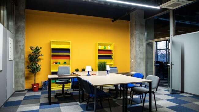
An office environment is not merely a place where work is done, but also a strategic design space that stimulates creativity, strengthens the spirit of collaboration, and increases productivity. Shaping this environment correctly in both aesthetic and functional terms is a key part of the space's formula for success. For this very reason, choosing the right colors for office furniture is vital not only for visual beauty but also for employee psychology, brand identity, and the overall balance of the working environment. Colors are among the most important visual elements influencing people's emotions and behavior. The color palette used can directly affect employees' energy, concentration, and motivation. For this reason, a color strategy should be planned and purposeful rather than random when choosing office furniture. In this blog post, we will provide detailed information about the importance of color selection in an office environment, its psychological impact, its compatibility with furniture materials, optimal tones for different roles and work areas, and other important factors. Throughout the article, we will include both practical recommendations and real-life examples.
Why Should We Pay Attention to Color Selection in the Office?
Color selection in office design is not just an aesthetic issue; it should also be evaluated functionally and psychologically. This factor influences employees’ everyday behavior, motivation, and performance, and, if not managed correctly, can create monotony and fatigue in the work environment. Colors evoke emotional responses that directly affect how employees feel throughout the day. Color selection requires an approach suited to both the space and its users. Below, we will cover the main subtopics under this heading:
The emotional impact of colors in the work environment
The emotional impact of colors is a very broad subject. In psychology, each color has a particular emotional association. For example, while blue creates a sense of calm and stability, orange represents energy and sociability. Red attracts attention, but when used for a long time, it can evoke feelings of aggression and stress. Colors used in the office environment can affect employees' daily emotional state and change their approach to work. The right color combinations increase motivation and positivity, while poorly chosen colors can create a negative mood. Taking emotional impact into account, colors should be selected differently for private offices and shared areas. For example, green and light tones are more suitable for relaxation areas. In meeting rooms, blue and neutral colors can enhance concentration.
The relationship between color and employee productivity
Productivity is directly linked to color selection. Research shows that employees working in blue and green surroundings are calmer and more focused. Yellow is suitable for creativity and positive energy. Red increases adrenaline and activity—but can have a tiring effect when used excessively. Tones that stimulate productivity should form the basis of furniture selection. This should be considered for both individual desks and team environments. Light, vibrant, and natural colors are more suitable for a productive work environment. This relationship between color and performance is already being applied in many international office designs.
Employee satisfaction and color harmony
Employees' comfort in the office affects their level of satisfaction. An aesthetically pleasing space created through a harmonious combination of colors gives employees a sense of belonging. Visual comfort is achieved when furniture and wall colors complement each other. This reduces stress and helps maintain emotional balance. A satisfied employee is more loyal, more motivated, and more productive. In offices with harmonious colors, employees feel more valued and considered. This directly affects their overall mood and performance.
Choosing colors with health and safety in mind
Color selection is important not only psychologically but also for physical health. Bright colors and strong contrasts can cause eye strain. Dark colors combined with poor lighting can create a depressive atmosphere. If used under unsuitable conditions, these colors increase stress and create imbalance in the work environment. Colors can also communicate safety messages. For example, red should be used in warning and danger areas. Calm, neutral tones are recommended for spaces used for prolonged work.
How Should a Color Palette Aligned with the Corporate Brand Be Chosen?
Colors play an important role in a brand's visual identity. The colors used in corporate office design should reflect the company's values, vision, and strategic goals. At first glance, customers and employees assess the company's professionalism and culture through its visual image. The color palette used in office furniture is one of the key elements of that visual image. We explain this issue in greater detail in the subsections below.
Techniques for creating a color palette from a logo
A logo is a company's visual passport. Applying the colors used in the logo to the office interior ensures visual continuity. For example, a company with a blue-toned logo can use different shades of the same tones on office walls, chairs, and desks. This method preserves brand consistency. The balance between the primary and secondary colors in the logo should also be reflected in the office space. Using the logo's color wheel as a basis when coordinating the color palette produces effective results. At the same time, it is important to consider whether the colors used in the logo will provide long-term visual comfort in the work environment.
Identifying colors that match the brand's personality
Every brand has its own personality: innovative, conservative, energetic, reliable, and so on. Colors express this personality in visual language. For example, bright orange or electric blue may be chosen for an innovative technology company. Financial and legal firms tend to prefer gray and black tones that convey a more classic, reliable impression. Choosing colors that express brand values directly affects customers’ and partners’ first impressions. This strategy also strengthens the sense of corporate identity among internal team members.
Aligning the brand with psychological color theory
Psychological color theory has a very important place in the work environment. Each color evokes a certain emotional response. Blue conveys trust, green naturalness and stability, orange energy, red strength and passion, yellow creativity and optimism, and gray neutrality and balance. A company should choose color codes that match the feelings it wants to convey to its audience. Applying this approach to furniture design expresses the brand’s character in the visual environment.
Color choices aligned with the brand’s long-term strategy
When choosing colors, it is important to consider not only current trends but also the brand's long-term plans. Fashionable tones may look appealing for short-term changes, but a lasting, classic palette creates a more stable image for a long-term corporate identity. For example, incorporating the “Pantone of the year” color into corporate office design can also be interesting, but the primary base colors should remain stable. This ensures that the overall visual identity remains intact during future updates.
Color Coordination Based on the Size and Lighting of the Space
The size of an office space and its lighting conditions are among the most important factors in successful color selection. The same color can create completely different visual effects in spaces of different sizes and with different lighting. Intelligent use of color is essential to avoid a cramped feeling in small areas and a cold, empty atmosphere in larger spaces. Lighting can change the depth, saturation, and overall atmosphere of the chosen color. Let us now explore the main nuances of this topic in detail.
Color selection for small offices
Light, reflective colors should be used in small offices. Light cream, beige, light gray, and pastel tones visually expand the space. Dark tones can create an oppressive effect in confined areas. A light color palette combined with mirrored surfaces, glass elements, and light-colored furniture makes a small office feel airier. These colors also reduce the need for lighting and help save energy. It is recommended to avoid multicolored contrasts in small spaces, as they can create visual clutter.
Creating color balance in large spaces
In large office spaces, by contrast, richer and deeper colors can be used to avoid a sense of emptiness. Shades such as dark gray, brown, chocolate, and deep blue give a spacious setting a sense of stability and comfort. However, these colors must also be applied in a balanced way so that they do not create a heavy atmosphere. Creating different color blocks for zoning in a large space makes it possible to achieve both visual dynamism and functional divisions. For example, one shade can be used in the meeting zone and another soothing shade in the relaxation zone.
Colors and natural light: choosing the right combination
Spaces with natural light offer more possibilities for color selection. Since the direction and intensity of sunlight change throughout the day, it is necessary to consider how the selected color looks at different times. With south-facing windows, strong sunlight can make light colors appear brighter and dark colors softer. In north-facing rooms, choosing warmer tones balances the lack of light. Because natural light changes color saturation, it is very important to consider this factor when developing a color palette.
Color techniques that make a space appear larger
Using colors intelligently is very important for creating optical illusions. Painting walls and ceilings in the same tones helps the ceiling look higher. Subdued flooring and light wall colors make a space look spacious and deep. Wall panels and furniture designs that create a vertical-line effect also increase the sense of space. These techniques are applied successfully, especially in startup offices, co-working spaces, and small business centers.
Creating Color Harmony Based on the Type of Lighting
Lighting is one of the most important complementary elements of color selection. The color we choose can create a completely different impression in daylight, artificial light, and warm or cool lighting tones. For this reason, it is important to consider the characteristics of light sources when developing the color palette for office furniture and walls. If lighting is not managed properly, even the most ideal color can create an unpleasant atmosphere in the office.
The effect of colors under artificial light
The saturation and warmth of colors change under artificial light. Traditional lamps with a yellowish tone can make blue and green colors appear more muted and warm colors brighter. Conversely, white light and fluorescent lamps make neutral and cool tones stand out. Furniture colors used under artificial light should prevent eye fatigue and provide visual comfort over long periods. Bright, highly contrasting colors can reflect under artificial light and negatively affect employee comfort. Therefore, choosing soft pastel tones and earth colors is recommended for spaces with artificial lighting.
Choosing a color palette for LED and fluorescent lighting
LED systems are widely used in modern offices. The color temperature of LED lights ranges from 2700K to 6500K. Warm LED light (2700K-3500K) supports warm-toned color palettes in spaces. Cool LED light (5000K and above) emphasizes cool colors such as blue, gray, and white. Fluorescent lighting is more compatible with neutral tones but can cause eye strain in some cases. When choosing a color palette, it is important to plan the type of light and its temperature in advance.
Colors that harmonize with natural lighting
Natural light creates different color effects at different times of the day. Morning hours bring soft golden tones, while midday brings brighter and more intense lighting conditions. Because of this variation, light beige, cream, light gray, green, and blue tones are widely used in naturally lit offices to achieve a stable visual effect. These colors provide gentle transitions that adapt to changes in light throughout the day. At the same time, the color of furniture positioned in front of windows should be resistant to UV rays so that it does not fade over time.
The impact of lighting colors on the color palette
The light source itself also affects color selection. For example, beige and cream tones create a warm, comfortable atmosphere under warm light with a temperature of 3000K. Under cool light above 5000K, these tones may appear paler. It is therefore recommended to test colors under actual lighting conditions rather than choosing them only from a paint catalog. Both light intensity and the angle of distribution shape the office’s overall color harmony.
The Psychological Effects of Colors and Their Suitability for the Workload
Although the psychological impact of colors in office design is sometimes invisible, its effect on the work environment is real enough to measure. Colors trigger certain emotional responses in our brains. This emotional impact directly affects employees’ everyday performance, motivation, and creativity. A well-chosen color palette creates harmony, balance, and efficiency in the workplace. Let us now look at the specific mechanisms through which colors exert their influence:
Yellow and orange – Colors that encourage energy and creativity
Yellow and orange symbolize energy. These colors activate the creative parts of the brain, produce positive emotions, and stimulate social interaction. Using yellow and orange tones in startup offices and creative agencies is very effective for increasing motivation. They strengthen optimism, new ideas, and willingness to take risks. However, highly saturated use can be tiring during long working hours. Using these colors as accents therefore produces more balanced results. For example, they are recommended for chairs, wall accents, and accessory details.
Black and red – Colors associated with leadership and attracting attention
Black and red symbolize power and leadership. Red immediately attracts attention, increases energy, and is associated with risk and danger. These colors can create a dynamic atmosphere in meeting rooms and areas requiring short periods of intense focus. Black conveys prestige, confidence, and serious professionalism. Black details in executive offices and corporate meeting rooms therefore reinforce a prestigious appearance. However, using these two colors unbalanced across large areas can create an aggressive, constricting effect. A soft balance should therefore be established in the overall palette.
Green and blue – Colors that reduce stress and improve focus
Green symbolizes nature and brings mental comfort. Green furniture and wall tones in offices reduce stress levels and help maintain attention for long periods. Blue provides a sense of calm and balance and improves concentration. Using a blue and green palette in analytical and research-oriented workspaces increases productivity. These tones are particularly beneficial for tasks requiring decision-making and deep thought. Shades of blue and green are often chosen as the main palette in banks, financial firms, and law firms.
Gray and cream – Concentration and neutral harmony
Gray and cream tones are the safest and most balanced choices for an office environment. Gray symbolizes neutrality and easily complements other colors. Cream conveys a sense of warmth and comfort. The combination of these two tones is widely used in both classic and modern office interiors. It creates a comfortable, calm, and non-fatiguing atmosphere for working over long periods. Gray and cream colors are equally effective in both private offices and large open-plan offices.
Purple – Stimulating creative thinking and creativity
Purple symbolizes creativity, intellect, and different ways of thinking. Using purple tones in advertising agencies, design studios, and artistic fields stimulates creativity. This color also conveys luxury, prestige, and distinctiveness. Purple accents in relaxation rooms, idea-generation spaces, and brainstorming zones increase motivation. However, using it on large surfaces can create a dark effect. Using it as an accent color therefore produces more balanced results.
Office Color Strategies for Different Business Sectors
Each business sector has different psychological and visual requirements according to its function, audience, and field of activity. The specific business focus must be considered when developing a color strategy. A color considered inspiring in one sector may be completely unsuitable in another. The following examples show ideal color approaches for different business sectors:
Effective Colors for the Creative Industry
Creative agencies, advertising companies, design studios, and media organizations favor vivid, bold colors to create an energetic, inspiring environment. Yellow, orange, electric blue, purple, and green tones stimulate creativity. They accelerate idea exchange among team members and increase activity in brainstorming sessions. These colors can be applied through wall accents, decorative elements, chairs, and desk details. Monotonous, neutral colors are discouraged in creative fields because they can stifle creativity.
The most suitable office color choices for the financial sector
For banks, insurance companies, audit firms, and consulting firms, trust, stability, and professionalism are the key messages. Gray, deep blue, dark green, and black tones are therefore widely used in the financial sector. These colors convey a reliable, professional, and serious impression to customers. They also strengthen concentration and discipline among staff. Excessive use of bright, aggressive colors in the financial sector is risky because it can undermine the brand’s stability.
Office color choices for technology and innovative sectors
Because technology companies are dynamic and future-oriented, they can be bolder in their choice of colors. Electric blue, neon green, orange, dark purple, and futuristic silver tones symbolize technological development, innovation, and modernity. These colors also increase the motivation of young employees and convey a message of openness to technological innovation. At the same time, these colors boost energy in open-plan workspaces and invigorate the collaborative environment.
Office colors that inspire trust in legal and consulting services
Trust and a professional image are the main priorities when choosing colors for law firms, notary offices, and consulting services. A more classic and conservative color palette is used here: dark brown, beige, deep gray, chocolate, and black. These colors help the company present a serious, trustworthy, and stable image to customers. In relaxation zones, soft beige and pastel cream tones are used to maintain balance and comfort.
Calming colors for medical and healthcare facilities
In medical clinics, dental centers, physiotherapy centers, and wellness centers, colors should help patients remain calm. Light blue, green, light purple, and pastel tones reduce stress and create psychological comfort. These colors also reinforce a sense of hygiene and cleanliness. Aggressive tones such as black, red, and orange should be used sparingly and only as accents in healthcare spaces. Every color choice here directly affects the patient’s emotional state.
Employee Roles and Furniture Color Choices
When developing an office color strategy, not only the business sector but also the working styles and psychological needs of different job groups should be considered. Creating an optimal visual environment for each type of role directly contributes to increased productivity. Below, we review suitable color choices for different job groups:
Suitable colors for executives and managers
Colors that convey prestige and authority are important for people in leadership positions. Colors such as black, deep gray, dark blue, and dark brown are widely used in executive offices. These colors create a visual image that is both serious and trustworthy. At the same time, it is advisable to avoid very light and bright tones in executive offices, as they can distract attention during decision-making. Adding dark red or purple accents strengthens the message of leadership and power.
An effective color palette for designers and creative workers
Visually stimulating colors increase motivation in spaces where creative teams work. Yellow, orange, light green, pastel blue, and purple tones serve as sources of inspiration for designers. The color palette here should avoid monotony, with every detail providing a different visual touch. Creating several contrasting zones on the walls and adding colorful furniture elements stimulates creativity. Excessive use of calm and neutral colors in this area can hinder the flow of ideas.
Colors that improve focus among analytical and technical employees
Calming, focus-enhancing colors are more suitable for analysts, programmers, economists, and employees in other fields that require concentration. Blue, light gray, green, and sometimes pastel yellow tones improve concentration. These colors reduce visual fatigue among employees who spend long periods in front of screens and help avoid sharp contrasts. It is also recommended to avoid abrupt color transitions when choosing furniture.
Colors for people working in social and customer services
Warm and friendly colors should be used in areas where customers are engaged. Light orange, cream, pastel green, soft yellow, and light beige facilitate social interaction. These colors give people a sense of comfort and reduce social barriers. Creating psychological comfort in the customer service department leads to more successful communication and satisfaction. Brand-appropriate accent colors can also be used.
Color Synergy in Layout and Zoning
Choosing an overall color scheme alone is not enough in office design. Using color to separate and coordinate functional zones within a space increases productivity, workflow efficiency, and opportunities for collaboration. Colors are an excellent visual tool for zoning and intuitively show employees what work takes place where.
Methods for zoning work areas with color
Main work areas, such as individual desks, team desks, and project sections, should be separated with distinct color blocks. For example, calm, neutral colors (gray, light green) can be used in individual concentration areas, while more energetic tones (yellow, light orange) can be applied in meeting and discussion zones. This visual separation also provides an intuitive signal to the employee’s brain: "focus here, exchange ideas there". Such zoning can be achieved through wall paint, floor coverings, and even furniture fabric colors.
Colors to use in relaxation areas
Relaxation areas should be specially designed to reduce office tension. A soothing color palette should take priority here. Soft blue, light green, cream, light beige, and purple are the most effective choices. Bright, stimulating colors should be avoided because these zones are intended for rest and stress reduction.
Color choices suited to active work areas
Vivid colors are preferred in areas intended for project discussions, idea generation, and group meetings. Orange, bright yellow, pastel green, and turquoise increase energy and strengthen team spirit in such zones. A visual atmosphere that creates motivation and a positive mood is important in active zones. Balanced application remains important, however, so the colors do not become tiring over long periods.
Effective colors for meeting rooms
Blue and neutral tones are considered ideal for meeting rooms. The effects of blue tones in improving concentration, facilitating decision-making, and reducing tension have been scientifically proven. Brown and dark green accent tones also convey leadership and reliability. It is advisable to avoid excessively bright and distracting colors in meeting rooms.
Ideal color combinations for entrance and waiting areas
The entrance and waiting area shape the first impression of customers and partners entering the office for the first time. It is advisable to introduce the company's brand colors here through subtle accents. Cream, light gray, pastel purple, and light green tones create calm and a welcoming atmosphere. Bright colors that cause visual stress should be avoided in the waiting area.
Matching Different Furniture Elements
In an office space, not only wall and floor colors but also color harmony between different furniture elements are very important for cohesion and a professional appearance. Matching furniture elements in terms of color and material creates aesthetic, functional, and psychological comfort.
Color Coordination of Desks and Chairs
Office desks and chairs should visually complement each other. Shades within the same color family—for example, a light wood tone paired with a beige fabric seat—create a harmonious appearance. By contrast, sharp contrasts—for example, a white desk with a red chair—may attract attention in certain situations but can become tiring with prolonged use. In executive offices, dark wood-toned desks and dark leather chairs reinforce an impression of prestige. Conversely, combinations of desks and chairs in light and pastel tones create a relaxed and friendly atmosphere in creative zones.
Color harmony of bookshelves and cabinets
Shelves and cabinets are often coordinated with wall and floor colors. Wooden shelves create a classic and natural appearance. White and light gray shelves are ideal for modern and minimalist styles. Adding metal accents and glass panels to cabinet doors increases visual dynamism. Keeping cabinet colors in the same tones as other large furniture pieces creates a calm and balanced appearance in the office.
Color coordination of partition panels with other elements
In open-plan offices, partition panels are used to visually separate work zones. Their colors should be matched to both the background wall and the desks. Calm, neutral tones (gray, light green, cream) reduce eye strain as well as improve acoustics. Vivid colors can also be used on accent panels to increase team motivation.
Complementing colors with decorative elements
Decorative accessories — clocks, paintings, plant pots, and wall art — are indispensable for completing the color palette. For example, orange or purple decorative elements placed against a predominantly neutral background create visual interest. Such accessories can also be changed according to the season or event to maintain a consistently fresh atmosphere in the office.
Methods for creating effective harmony with contrasting colors
Sometimes contrasting colors are needed to create visual dynamism in an office. For example, a red chair and an orange wall painting against a light gray desk create an energetic atmosphere. However, these contrasts should be applied in a balanced way so they do not become tiring. When creating contrast, the ratio of base and accent tones should be set correctly.
Furniture Materials and Their Natural Tones
The natural color tones of materials used in office furniture significantly influence the overall aesthetic and functional quality of the design. Since each material has distinctive color and texture characteristics, choosing the right combinations creates both visual harmony and a high-quality, durable office environment.
Principles of color coordination in wooden materials
Wood is one of the most commonly used materials in office furniture. Natural wood colors—light oak, walnut, hazelnut, chestnut, and dark mahogany—convey a sense of comfort, warmth, and quality. In Scandinavian style, light oak and beech tones enhance the effect of light and make the space appear larger. Dark chestnut and mahogany tones create a prestigious and serious appearance in executive offices. Coordinating the color harmony of wood materials with other furniture elements produces a truly impressive visual result.
The effect of metal and aluminum elements on the color palette
Metal elements (chrome, aluminum, steel) are widely used in modern office design. Cool-toned metals (chrome, silver, aluminum) create a futuristic and technological appearance. These elements combine very successfully with gray, blue, white, and black tones. Metal details also give furniture a sense of lightness and visual elegance. Dark metal tones can create a more serious and premium image.
Color selection strategies for glass elements
Glass symbolizes transparency, openness, and spaciousness in office design. Glass tables, partitions, and display cabinets increase light distribution and visually enlarge the space. Glass elements are usually used with neutral background colors: white, beige, and light gray. Visual dynamism can also be created by adding a lightly purple-, blue-, or green-tinted coating to the glass.
Combining plastic furniture with suitable colors
Plastic furniture is widely used, especially in modern and minimalist office design. It has a broader color spectrum and can be manufactured in pastel, bright, neon, and matte tones. Plastic’s flexibility and ability to take different shapes provide considerable freedom in applying color. However, bright, very vivid plastic colors can become tiring during long-term office use, so calmer, softer tones are recommended.
Creating color balance in mixed-material furniture
Furniture combining materials such as wood and glass, metal and wood, or plastic and metal is widespread in modern offices. Color balance is particularly important in such hybrid furniture. For example, a light wood + matte black metal combination creates a very modern appearance. Glass + chrome + wood combinations create an atmosphere that is both classic and innovative. With these combinations, visual flow and softness between colors must be ensured to preserve harmony in the office.
Achieving Color Harmony with Natural Elements
In recent years, the concept of biophilic design — integrating nature into interiors — has gained particular importance in office design. Natural elements increase productivity in the work environment by creating both visual beauty and psychological comfort. The right color harmony between natural materials and living elements further strengthens this effect.
The effect of plants on color harmony
Live plants create a calming effect in the office with their natural green tones. Plants restore employees’ emotional balance, particularly in high-stress work areas. Green tones look brighter and fresher against a neutral background (white, cream, light gray). Bright green plants sometimes increase visual energy in dark offices. The color of plant pots should also be considered as part of the overall palette. Dark gray, black, or white ceramic pots highlight the plants’ colors.
Matching stone and pebble elements with office colors
Natural stone elements — marble, granite, and pebbles — add elegant, lasting visual value to an office. Marble tables, stone wall panels, and decorative areas with pebbles convey luxury and stability. Since stone materials usually have neutral tones (white, gray, beige), they harmonize easily with other colored elements. The unique textures of natural stone strengthen a sense of dynamism and natural beauty in the office.
Color harmony with natural wood
Wood materials are the finest symbol of naturalness. Light oak and beech tones create a calm and balanced environment. Dark walnut and mahogany convey prestige and classic style. Pastel and neutral wall colors (light gray, cream, green) look more effective above wooden furniture. At the same time, wood's natural grain texture adds visual depth to the interior.
Color coordination of natural textiles and woven products
Natural textiles such as linen, cotton, and wool create a special sense of comfort in office decor. When curtains, sofa covers, and decorative cushions are made from these materials, they offer a wide range of options for color harmony. Pastel beige, light gray, soft green, and cream tones work perfectly with natural textiles. Such combinations of soft textures and colors create visual calm and a professional aesthetic.
Integrating water features (aquarium, water wall) with colors
Water features — aquariums and water walls — provide both visual and acoustic comfort. Aquariums with blue and green tones create a soothing atmosphere. Light gray or cream walls behind an aquarium bring the movement of the water into greater visual focus. Adding LED lighting to water walls enhances the depth of blue tones and creates a relaxing effect in the office.
Unique Personal Taste and Office Aesthetics
Office color design should not be based solely on technical rules. Since every office has its own distinctive spirit, team culture, and work philosophy, an individual approach plays an important role in color selection. Color harmony also means aesthetic satisfaction, individuality, and creative distinction.
The role of users' personal tastes in color selection
Employees feel more comfortable and motivated when colors are chosen to suit their daily work rhythm and personality types. Some teams need a calmer color environment, while others need a more energetic one. For example, pastel and neutral tones are more suitable for introverted teams. Extroverted and creatively inclined groups draw inspiration from bright, vivid colors. Management should therefore consider team members’ opinions when developing a color strategy.
Balancing universal color principles with individual preferences
Some general rules apply to all offices: light tones make a space look larger, while dark tones convey prestige and seriousness. However, these principles should be balanced with personal taste. Taking certain risks in line with the office’s conceptual theme can sometimes produce successful results. For example, even in a classic bank office, adding soft orange accents can create a more modern, open image for observers.
Testing and experimentation methods for color selection
Testing color samples in actual spaces before making a theoretical selection is recommended. Testing small sample panels under different lighting conditions provides a more realistic picture of the color's eventual effect. Visual synergy should be tested by placing different furniture samples close to one another. At the same time, 3D visualization programs also play an important role at this stage.
Color selection strategies for future changes
Office design is a long-term investment. When future changes are planned, keeping the core color palette neutral is a smart strategy. Adding changing accent colors to a predominantly neutral background makes it easy to adapt to new trends. Such a flexible system prevents major expenses during future updates.
Color consultations and professional advice for a perfect result
Professional designers and interior consultants have extensive knowledge of color psychology, lighting, and functional planning. Their recommendations can help create an office space that is ideal both aesthetically and ergonomically. Color consultation is an important stage, particularly in large corporate office projects. A professional approach preserves brand identity while maximizing employee satisfaction.