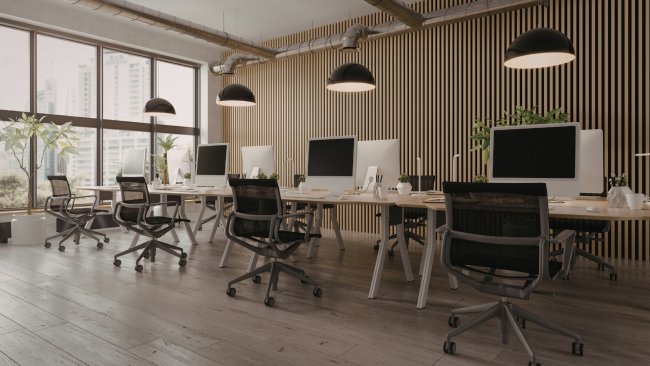
The office space is one of the important settings that simultaneously reflects a company's outward image and internal culture. Brand colors are among the key visual elements that make this space memorable at first glance. With the right furniture selection, an office can make a strong impression aesthetically, functionally, and corporately. Many companies focus only on the logo and wall colors, but furniture is also an important part of the brand impression. Furniture without color coordination can weaken the office's professional appearance. Well-chosen desks, seating, cabinets, and upholstered furniture, on the other hand, reinforce the brand's visual language. This approach conveys a more unified visual message to both customers and employees. An office designed to match brand colors expresses the company's values more clearly. At the same time, it creates a sense of order and harmony in the working environment. The psychological effects of colors must also be considered when choosing furniture. For example, while blue tones create a sense of trust, green tones convey comfort and balance. Red can create a more energetic atmosphere, while yellow can foster a more creative one. However, applying all these colors directly to furniture does not always produce a successful result. The main aim here is not to reproduce the brand color exactly, but to incorporate it into the interior in the right proportion. When choosing office furniture, materials, shape, and size should be considered alongside color. In open-plan offices, color balance should be planned more broadly. In small offices, bulky, dark-toned furniture can make the space appear smaller than it is. Creating an office that matches brand colors is a process that requires a professional approach. Visual identity, ease of use, and durability all play key roles in this process. When properly planned, such an office space conveys the company's strength and style in every detail.
Furniture selection must not begin without analyzing the brand identity
The first step in selecting furniture to match brand colors is properly analyzing the company’s visual identity. Looking only at the main logo is not sufficient. The company’s color palette, font style, and overall tone of communication should be evaluated together. For example, a premium brand may prefer more refined, restrained tones. A young, dynamic brand may choose bolder color transitions. The furniture should carry this same character. Simple-lined furniture with a clean appearance is more suitable for minimalist brands. Creative agencies can use furniture with freer forms and accent colors. If the brand’s main color is very bright, applying it to every piece of furniture would be inappropriate. In such cases, the main color should be treated primarily as an accent. Neutral tones should be used for the base furniture to create balance. If a brand book exists, it should certainly be used during furniture selection, because it specifies color usage, tonal proportions, and visual direction more precisely. This document makes shared decision-making between the designer, management, and supplier easier. Office furniture is consequently selected to match the brand identity rather than at random.
The balance between primary and accent colors must be established correctly
Color balance should be professionally planned to create an interior that matches brand colors. The most important principle is the proper distribution of the main color, supporting colors, and neutral tones. The main brand color can be a dominant interior element, but it does not have to appear in every piece of furniture. For example, if the main color is blue, choosing all chairs, desks, and cabinets in blue can make the space visually tiring. A better approach is to establish a base with white, gray, beige, or wood tones. The brand color can be used as an accent in chair fabric, sofa cushions, panels, or dividers. This creates an attractive appearance and strengthens the color’s impact. Light tones make the space look spacious and bright. Dark tones create a more serious, prestigious atmosphere. In a small office, large pieces of very dark furniture should be avoided. In large offices, balancing dark tones with light elements is easier. Lighting should also be considered when choosing colors, because natural and artificial light can make the same tone look different. Checking furniture samples under actual lighting conditions reduces the risk of later mismatches. Bright brand colors look more refined when combined with matte surfaces. A properly established color balance therefore highlights the brand and gives the office a professional appearance.
The right relationship should be established between aesthetics and functionality
Office furniture selection should not be limited to an attractive appearance. Brand-aligned furniture should also be comfortable and functional for daily use. Seats used for hours by employees should be selected correctly from an ergonomic perspective. Desk dimensions should be planned to suit the work process. Storage cabinets should be practical and consistent with the overall design. Material quality requires special attention when choosing furniture to match brand colors, because poor-quality materials can deform quickly and spoil the overall appearance. The color coordination of wood, metal, laminate, and fabric surfaces should be considered together. For example, warm-toned wooden surfaces can create a more personable atmosphere for certain brands. Metal and glass elements give a more corporate, modern appearance. Attractive furniture that is uncomfortable to use is not a successful long-term choice. Easy-to-clean materials are also more practical for offices. If brand colors are light, more durable materials should be selected for surfaces that readily become dirty. Furniture shapes should also match the company’s style, because classic forms may conflict with a futuristic brand language. The ideal furniture therefore carries the brand’s visual identity while enabling employees to work comfortably and productively.